What is Contrast in Art? Examples and Definition
Have you ever asked yourself what are all the different elements that can create contrast in art, and how do artists use those elements to convey the meaning of the artwork? The common goal of any language, and this applies to the language of visual art, is the need to convey meaning and to express a certain emotion, idea, concept, or belief. Relying on elements in art, the line, space, color, and texture, the authors along their different journeys leave their own personal marks. As a step up, principles of art help the authors arrange different parts of their paintings, graphic design works, or sculpture, in order to gain the interest of their audience.
As one of the major art principles, contrast in art, is by many considered to be the golden rule for creation. In essence, the definition of contrast is the juxtaposition of difference, used to intensify the properties within the work, the contrast in art is closely related to the variety. Exploring the arrangement of contrasting parts, such as light and dark, opposite hues of the color wheel, texture, and size, contrast is employed to create the rhythm, or to strengthen the focus of the artwork.
The Light and Dark Contrast in Art
As we mentioned above, the contrast within various parts of the painting, many creatives use to their advantage. Running away from repetition and the same shapes, lines, and colors, many painters use contrast as a vehicle for catching the public’s attention. Seen as a compositional tool, which helps to create the movement and rhythm of a painting, contrast is also seen as an important vehicle for the creation of a dramatic atmosphere.
The bold contrasts between light and dark, known as chiaroscuro, in the hands of the famous Renaissance painters of the 17th and 18th-century, was not only a means for modeling, but was put to use as a vehicle to differentiate between the main figures and the background, creating the depth of the painting. But more importantly, it helped the painters research the notion of darkness helping them to build certain narratives.[1] Some of the most disturbing images in paintings and in printed art, employing the traditional printmaking technique, the aquatint, employ the light and dark or black and white contrasts. This helped painters present different religious ideas or bring the mysterious world of dreams closer to the public.
Contrast in Contemporary Art : Trickery for the Eye
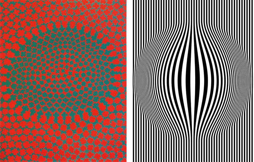
The tradition of the Op art movement, is possibly the best-known arena where many artists, such as M.C. Escher explored and played with the pattern designs and the world of the black and white contrast. Such sharp contrasts often explored the idea of the movement within a static image, making the still image appearing to vibrate. This stark difference in contrast, along with the experimentation with horizontal or vertical line and geometrical shapes, denies the eye a resting place.
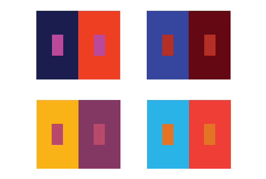
This is also visible if one plays with color, specifically complementary color combinations. As they are located directly opposite of each other on the color wheel, they are the best examples to help illustrate color contrast. The red and green, blue and orange, yellow and purple,[2] are often put next to each other to help make the image pop, or to play with the image size. The contrast of red and green, if attention is not placed on the value of the color (and by this, we refer to the darkness or the lightness of the color) is often very disturbing for the eye and it is one of the combinations that would appear slightly blurry on a digital screen.
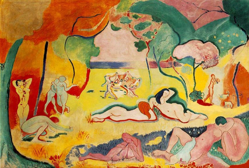
Often, this trickery of the eye inspired painters and printmakers to play with bold color combinations in order to achieve different contrast in art. We have some of the best examples of this in the works of the famous painter Henri Matisse, not to mention his fellow painters of the Fauvism movement.
Be sure to check out works by Matisse on our marketplace!
The Value of the Opposites - Why is the Contrast Important?
The true value of the contrast in art lies in the building of the concept or the idea of the work. The opposite is important not only as a tool to define the focus but the various combinations can suggest the idea of the contrasts of the subject matter[3], various realities, such as the idea of the real world and imagination, or point to highly constructed situations which will help to reflect certain beliefs within one society. Various authors focus their production on the reflections about various dualities, and these may be viewed as contrast on a more philosophical level.
Contrast in art could be viewed as a tool to help define the identity of the finished product. Without contrast, the painting or a sculpture can become invisible if it doesn’t consider the arrangement of its contrasting parts, not to mention the space for the end display.[4] In keeping and thinking about the opposite one can continue to create and to push the boundaries of contemporary art production forward.
Editors’ Tip: Visual Contrast: The Painter's Secret Geometry: A Study of Composition in Art (Dover Books on Fine Art)

This is possibly one of the best books that explore the building of various art compositions showcased in some of the most mesmerizing examples of creativity and its history. Exploring traditional ideas of the golden rule, the golden man and other geometrical patterns, the book is an excellent guide towards the contrasting periods and the creation tactics of old masters, and 20th-century painters such as Picasso, Kandinsky, Klee, and Pollock. Aiming to bring to the reader the understanding of all the compositional tools and principles, the book is a must-have for anyone that wants to learn more about the process of work of their favorite painters.
References:
- Anonymous, Chiaroscuro Definition , Merriam Webster Dictionary, September, 2016
- Fussell Matt, Contrast in Art – The Value Factor, The Virtual Instructor, September, 2016
- Lamp Lucy, Design in Art: Balance and Contrast , SOPHIA Learning, September, 2016
- Stephen David Ross, (1994), Art and Its Significance: An Anthology of Aesthetic Theory, Third Edition, Suny Press
All images used for illustrative purposes only. Featured image: Gerrit Van-Honthorst - The Matchmaker. Image-via-wikipediacom
Download W.News app today and read everything you need to know about the art world on the go

Can We Help?
Have a question or a technical issue? Want to learn more about our services to art dealers? Let us know and you'll hear from us within the next 24 hours.